Interactivity#
The previous notebook showed all the steps required to get a Datashader rendering of your dataset, yielding raster images displayed using Jupyter’s “rich display” support. However, these bare images do not show the data ranges or axis labels, making them difficult to interpret. Moreover, they are only static images, and datasets often need to be explored at multiple scales, which is much easier to do in an interactive program.
To get axes and interactivity, the images generated by Datashader need to be embedded into a plot using an external library like Matplotlib or Bokeh. As we illustrate below, the most convenient way to make Datashader plots using these libraries is via the HoloViews high-level data-science API, using either Bokeh or Plotly. HoloViews encapsulates the Datashader pipeline in a way that lets you combine interactive datashaded plots easily with other plots without having to write explicit callbacks or event-processing code.
In this notebook, we will first look at the HoloViews API, then at Datashader’s new native Matplotlib support.
Embedding Datashader with HoloViews#
HoloViews (1.7 and later) is a high-level data analysis and visualization library that makes it simple to generate interactive Datashader-based plots. Here’s an illustration of how this all fits together when using HoloViews+Bokeh:
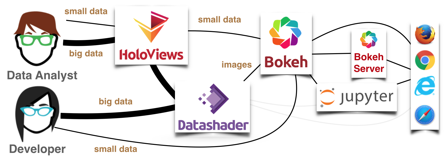
HoloViews offers a data-centered approach for analysis, where the same tool can be used with small data (anything that fits in a web browser’s memory, which can be visualized with Bokeh directly), and large data (which is first sent through Datashader to make it tractable) and with several different plotting frontends. A developer willing to do more programming can do all the same things separately, using Bokeh, Matplotlib, and Datashader’s APIs directly, but with HoloViews it is much simpler to explore and analyze data. Of course, the previous notebook showed that you can also use datashader without either any plotting library at all (the light gray pathways above), but then you wouldn’t have interactivity, axes, and so on.
Most of this notebook will focus on HoloViews+Bokeh to support full interactive plots in web browsers, but HoloViews+Plotly works similarly for interactive plots, and we will also briefly illustrate the non-interactive HoloViews+Matplotlib approach, followed by a non-HoloViews Matplotlib approach at the end. Let’s start by importing some parts of HoloViews and setting some defaults:
import holoviews as hv
import holoviews.operation.datashader as hd
hd.shade.cmap=["lightblue", "darkblue"]
hv.extension("bokeh", "matplotlib")


Next we’ll start with the same example from the previous notebook:
import pandas as pd
import numpy as np
import datashader as ds
import datashader.transfer_functions as tf

num=100000
np.random.seed(1)

dists = {cat: pd.DataFrame(dict([('x',np.random.normal(x,s,num)),
                                 ('y',np.random.normal(y,s,num)),
                                 ('val',val),
                                 ('cat',cat)]))
         for x,  y,  s,  val, cat in
         [(  2,  2, 0.03, 10, "d1"),
          (  2, -2, 0.10, 20, "d2"),
          ( -2, -2, 0.50, 30, "d3"),
          ( -2,  2, 1.00, 40, "d4"),
          (  0,  0, 3.00, 50, "d5")] }

df = pd.concat(dists,ignore_index=True)
df["cat"]=df["cat"].astype("category")
HoloViews+Bokeh#
Rather than starting out by specifying a figure or plot, in HoloViews you specify an Element object to contain your data, such as Points for a collection of 2D x,y points. To start, let’s define a Points object wrapping around a small dataframe with 10,000 random samples from the df above:
points = hv.Points(df.sample(10000))

points
As you can see, the points object visualizes itself as a Bokeh plot, where you can already see many of the problems that motivate datashader (overplotting of points, being unable to detect the closely spaced dense collections of points shown above, and so on). But this visualization is just the default representation of points; the actual points object itself is merely a data container:
points.data.head()
| x | y | val | cat | |
|---|---|---|---|---|
| 184289 | 2.164107 | -2.038032 | 20 | d2 |
| 8258 | 1.997346 | 1.983239 | 10 | d1 |
| 186900 | 2.176841 | -2.070830 | 20 | d2 |
| 161735 | 1.981356 | -2.084261 | 20 | d2 |
| 149948 | 2.018556 | -2.000011 | 20 | d2 |
HoloViews+Datashader+Matplotlib#
The default visualizations in HoloViews work well for small datasets, but larger ones will have overplotting issues as are already visible above, and will eventually either overwhelm the web browser (for the Bokeh frontend) or take many minutes to plot (for the Matplotlib backend). Luckily, HoloViews provides support for using Datashader to handle both of these problems:
hv.output(backend="matplotlib")
agg = ds.Canvas().points(df,'x','y')
(
hd.datashade(points) +
hd.shade(hv.Image(agg)) +
hv.RGB(np.array(tf.shade(agg).to_pil()), bounds=(-10,-10,10,10))
).opts(fig_size=40)
Here we asked HoloViews to plot df using Datashader+Matplotlib, in three different ways:
A: HoloViews aggregates and shades an image directly from the
pointsobject using its own datashader support, then passes the image to Matplotlib to embed into an appropriate set of axes.B: HoloViews accepts a pre-computed datashader aggregate, reads out the metadata about the plot ranges that is stored in the aggregate array, and passes it to Matplotlib for colormapping and then embedding.
C: HoloViews accepts a PIL image computed beforehand and passes it to Matplotlib for embedding, along with information about what data bounds it covers (which isn’t needed in B because the aggregate array preserves that information).
As you can see, option A is the most convenient; you can simply wrap your HoloViews element with datashade and the rest will be taken care of. But if you want to have more control by computing the aggregate or the full RGB image yourself using the API from the previous notebook you are welcome to do so while using HoloViews+Matplotlib (or HoloViews+Bokeh, below) to embed the result into labelled axes.
HoloViews+Datashader+Bokeh#
The Matplotlib interface only produces a static plot, i.e., a PNG or SVG image, but the Bokeh and Plotly interfaces of HoloViews add the dynamic zooming and panning necessary to understand datasets across scales:
hv.output(backend="bokeh")
hd.datashade(points)
Here, hd.datashade is not just a function call; it is a replayable “operation” that dynamically calls Datashader every time a new plot is needed by Bokeh. The above plot will automatically be interactive when using the Bokeh frontend to HoloViews, and Datashader will be called on each zoom or pan event if you are running a live notebook. Note that you’ll only see an updated image on zooming in if there is a live Python process running.
Whatever data has been given to the browser can be viewed interactively, but in this case only a single image of the data is given at a time, and so you will not be able to see more detail when zooming in unless the Python (and thus Datashader) process is running. In a static HTML export of this notebook, such as those on a website, you’ll only see the original pixels getting larger, not a zoomed-in rendering as in the callback plots above.
If you are running a live process, you can experiment with the interactivity yourself. You can zoom in using a scroll wheel (as long as the “wheel zoom” tool is enabled on the right) or pan by clicking and dragging (as long as the “pan” tool is enabled on the right). Each time you zoom or pan, the callback will be given the new viewport that’s now visible, and datashader will render a new image to update the display. The result makes it look as if all of the data is available in the web browser interactively, while only ever storing a single image at any one time. In this way, full interactivity can be provided even for data that is far too large to display in a web browser directly. (Most web browsers can handle tens of thousands or hundreds of thousands of data points, but not millions or billions!)
Interactive visualization with spread#
One advantage when using HoloViews operations is that you can chain them to make expressions for complex interactive visualizations. For instance, here is an interactive version of the plots showing the spread transformation shown at the end of the previous notebook:
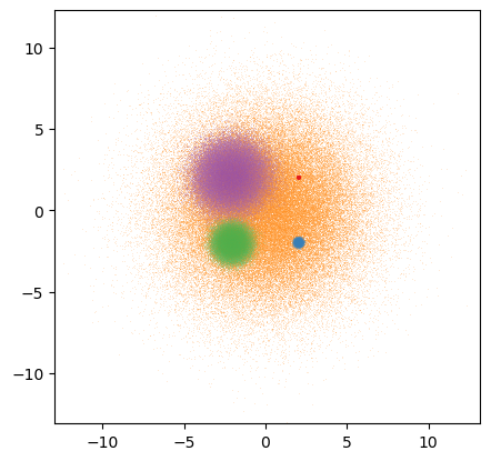
datashaded = hd.datashade(points, aggregator=ds.count_cat('cat')).redim.range(x=(-5,5),y=(-5,5))
hd.dynspread(datashaded, threshold=0.8, how='over', max_px=5).opts(height=500,width=500)
You can read more about HoloViews support for Datashader at holoviews.org.
HoloViews+Datashader+Bokeh Legends#
As explained in the HoloViews User Guide, you’ll want to use the HoloViews rasterize operation whenever you can, instead of datashade, because rasterize lets the plotting library do the final colormapping stage, allowing it to provide colorbars, legends, and interactive features like hover that reveal the actual (aggregated) data. However, plotting libraries do not yet support all of Datashader’s features, such as shade’s categorical color mixing, and in those cases you will need to use special techniques like those listed here.
If you are using Datashader’s shading, the underlying plotting library only ever sees an image, not the individual categorical data, and so it cannot automatically show a legend. But you can work around it by building your own categorical legend by adding a suitable collection of labeled dummy points:
from datashader.colors import Sets1to3

datashaded  = hd.datashade(points, aggregator=ds.count_cat('cat'), color_key=Sets1to3)
gaussspread = hd.dynspread(datashaded, threshold=0.50, how='over').opts(height=400,width=400)

color_key = [(name,color) for name,color in zip(["d1","d2","d3","d4","d5"], Sets1to3)]
color_points = hv.NdOverlay({n: hv.Points([0,0], label=str(n)).opts(color=c,size=0) for n,c in color_key})

color_points * gaussspread
HoloViews+Datashader+Bokeh Hover info#
Bokeh offers tools for selecting data points or hovering over them to reveal information about them, but a Datashader plot no longer has any individual data points, only aggregated data. You can still reveal the numerical aggregated values (left plot below), or you can render down to RGB but then overlay other coarsely aggregated data if that is more useful (right two plots below).
from holoviews.streams import RangeXY

pts = hd.datashade(points, width=400, height=400)

rasterized = hd.rasterize(points).opts(tools=['hover'])

quadmesh =  hv.QuadMesh(hd.aggregate(points, width=12, height=12, dynamic=False)) \
            .opts(tools=['hover'], alpha=0, hover_alpha=0.2)

dynamic = hv.util.Dynamic(hd.aggregate(points, width=12, height=12, streams=[RangeXY]),
                          operation=hv.QuadMesh) \
          .opts(tools=['hover'], alpha=0, hover_alpha=0.2)

rasterized.relabel("Pixel hover").opts(cmap=["lightblue","darkblue"], cnorm="eq_hist") + \
(pts * quadmesh).relabel("Fixed square hover") + \
(pts * dynamic).relabel("Dynamic square hover")
In the above examples, the “fixed square hover” plot provides coarse hover information from a square patch at a fixed spatial scale, while the “dynamic square hover” plot reports on a square area that scales with the zoom level so that arbitrarily small regions of data space can be examined, which is generally more useful.
As you can see, HoloViews makes it just about as simple to work with Datashader-based plots as regular Bokeh plots (at least if you don’t need color keys!), letting you visualize data of any size interactively in a browser using just a few lines of code. Because Datashader-based HoloViews plots are just one or two extra steps added on to regular HoloViews plots, they support all of the same features as regular HoloViews objects, and can freely be laid out, overlaid, and nested together with them. See holoviews.org for examples and documentation for how to control the appearance of these plots and how to work with them in general.
HoloViews+Datashader+Panel#
To interactively explore data in a dashboard, you can combine Panel with HoloViews and Datashader to create an interactive visualization that allows you to toggle aggregation methods, edit colormaps, and generally interact with the data through the use of widgets (50 lines of code):
Native support for Matplotlib#
As of Datashader 0.12, Datashader now has a native (non-HoloViews) interface for Matplotlib users based on a custom Matplotlib artist that can be used to explore a dataset using a dynamic datashading pipeline. These pipelines can be created using the function dsshow, which is inspired by the imshow and matshow API from Matplotlib.
In a live notebook in interactive mode, the pipeline will be run on every zoom or pan event. Conveniently, cursor hover events will reveal the underlying data aggregate values rather the image RGB values. These custom Matplotlib artists also provide native support for colorbars and legends.
# Choose the interactive 'widget' mode for Jupyter Notebook or Lab if desired (instead of inline used on the website)
#%matplotlib widget
%matplotlib inline
Note that if you wish to try the interactivity offered by %matplotlib widget you will need to pip or conda install the ipympl package, clear the notebook output, restart your notebook server, and re-execute the notebook.
import matplotlib.pyplot as plt
from datashader.mpl_ext import dsshow, alpha_colormap
Recall our example dataset:
df
| x | y | val | cat | |
|---|---|---|---|---|
| 0 | 2.048730 | 1.932436 | 10 | d1 |
| 1 | 1.981647 | 2.018171 | 10 | d1 |
| 2 | 1.984155 | 2.035502 | 10 | d1 |
| 3 | 1.967811 | 2.009870 | 10 | d1 |
| 4 | 2.025962 | 2.001917 | 10 | d1 |
| ... | ... | ... | ... | ... |
| 499995 | -0.403371 | 0.178735 | 50 | d5 |
| 499996 | -0.789219 | 0.421046 | 50 | d5 |
| 499997 | -0.328643 | -1.788483 | 50 | d5 |
| 499998 | -0.044550 | 3.558120 | 50 | d5 |
| 499999 | 4.419281 | 0.940194 | 50 | d5 |
500000 rows × 4 columns
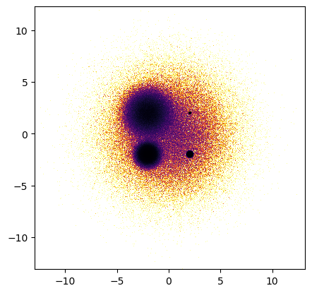
To start exploring the data, all dsshow needs is: (1) the dataframe, (2) the glyph and (3) an aggregator.
The default aggregator is tf.count(), so we leave it out in the example below. When an existing axis is not passed as an argument, dsshow creates a new figure.
dsshow(df, ds.Point('x', 'y'), norm='eq_hist', cmap="inferno_r");
Scalar aggregation#
When using scalar aggregators like tf.count(), the normalization and colormapping of the resulting 2D aggregates are handled natively by Matplotlib rather than by Datashader. However, all of the tf.shade functionality is preserved.
Colormapping#
Like Matplotlib’s image artist, the colormap is set using the cmap parameter, which accepts the name of a Matplotlib colormap or a colormap instance. Alternatively, like tf.shade, a list of colors can be passed and will be converted into a colormap. To generate a transparency-based colormap like shade does when given a single color, a separate convenience function alpha_colormap is provided.
Normalization#
The value re-scaling applied to every aggregate before colormapping is controlled by the norm parameter. As with Matplotlib’s image artist, this argument can be an instance of any Matplotlib norm.
Additionally, the same values as tf.shade’s how parameter are also accepted as arguments: "linear", "log", "cbrt", and "eq_hist", and will produce corresponding Matplotlib norms. Datashader ships with a Matplotlib histogram normalizer to implement eq_hist. Unlike tf.shade, dsshow’s default normalization is linear.
Like image artists, parameters vmin and vmax can be provided independently of a norm to fix the norm’s minimum and/or maximum values. If either is None (default), then that value will be automatically set to the corresponding extreme value in the currently visible range and will update on every pan or zoom.
Colorbars#
The Datashader artist can be used like other Matplotlib image artists to make a colorbar.
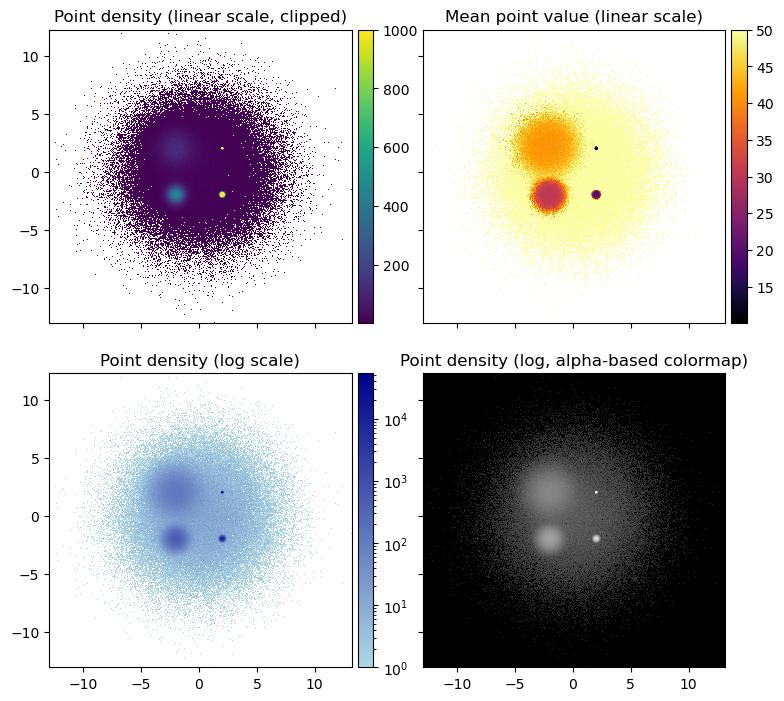
See examples of tuning these options below.
from mpl_toolkits.axes_grid1 import ImageGrid

fig = plt.figure(figsize=(9, 9))

# Here, we create a grid of axes using ImageGrid
# https://matplotlib.org/3.1.0/gallery/axes_grid1/demo_axes_grid.html
grid = ImageGrid(fig, 111, nrows_ncols=(2, 2), axes_pad=0.5, share_all=True,
                 cbar_location="right", cbar_mode="each", cbar_size="5%", cbar_pad="2%")

artist0 = dsshow(df, ds.Point('x', 'y'), ds.count(), vmax=1000, aspect='equal', ax=grid[0])

plt.colorbar(artist0, cax=grid.cbar_axes[0]);
grid[0].set_title('Point density (linear scale, clipped)');

artist1 = dsshow(df, ds.Point('x', 'y'), ds.mean('val'), cmap='inferno', aspect='equal', ax=grid[1])
plt.colorbar(artist1, cax=grid.cbar_axes[1]);
grid[1].set_title('Mean point value (linear scale)');

dsblue=['lightblue', 'darkblue']
artist2 = dsshow(df, ds.Point('x', 'y'), ds.count(), norm='log', cmap=dsblue, aspect='equal', ax=grid[2])
plt.colorbar(artist2, cax=grid.cbar_axes[2]);
grid[2].set_title('Point density (log scale)');

artist3 = dsshow(df, ds.Point('x', 'y'), norm='log', cmap=alpha_colormap('#ffffff', 40, 255), ax=grid[3])
grid[3].set_facecolor('#000000');
grid.cbar_axes[3].set_visible(False);
grid[3].set_title('Point density (log, alpha-based colormap)');
fig
Categorical aggregation#
When passing a categorical aggregator like tf.count_cat to dsshow, the actual shading gets handled by Datashader rather than by Matplotlib. dsshow exposes the categorical parameters of tf.shade, such as color_key. The use of min_alpha and alpha is encapsulated in a separate parameter called alpha_range that accepts a pair of values.
Legends#
For categorical aggregates, the Datashader artist has a get_legend_elements method that can be used to generate a legend showing the color of each categorical label.
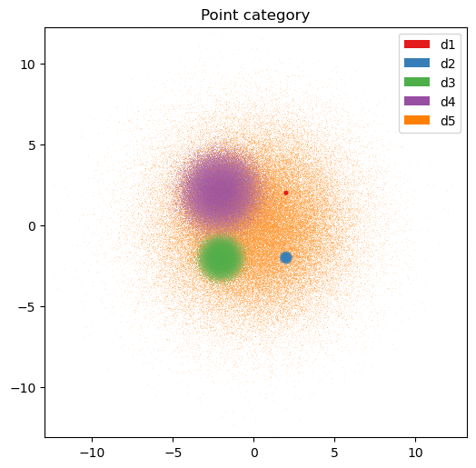
plt.figure(figsize=(6, 6))
ax = plt.subplot(111)

artist4 = dsshow(
    df,
    ds.Point('x', 'y'),
    ds.count_cat('cat'),
    ax=ax
)
plt.legend(handles=artist4.get_legend_elements());
plt.title('Point category');
Hooks#
dsshow also supports inserting optional hooks into the datashading pipeline:
A post-aggregation hook (
agg_hook): receives the aggregate calculated from the current view extent and returns another aggregate. It can be used to transform the aggregated values before shading.A post-shading hook (
shade_hook): receives the uint32-encoded raster image of the current view extent and returns another raster image. It can be used to perform operations such as RGBA spreading (which is now also supported on aggregates).
Here are examples of adding dynspread as a post-shading hook:
from functools import partial

fig, (ax1, ax2) = plt.subplots(nrows=1, ncols=2, sharex=True, sharey=True)

dsshow(df, ds.Point('x', 'y'), ds.count_cat('cat'), ax=ax1);

dsshow(df, ds.Point('x', 'y'), ds.count_cat('cat'), shade_hook=tf.dynspread,
       x_range=(-2, -1.5), y_range=(-2, -1.5), ax=ax2);
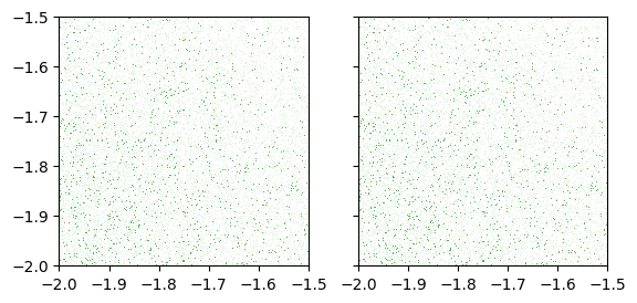
dsshow(df, ds.Point('x', 'y'), ds.count_cat('cat'), shade_hook=partial(tf.dynspread, threshold=0.50, how='over'));
As the above examples show, Datashader combined with your favorite plotting library (Bokeh, Matplotlib, or Plotly) along with the optional high-level HoloViews interface allows you to have the power of Datashader aggregations without giving up on most of the features of a normal plotting library (axes, colorbars, legends, and interactivity).
Now that you have completed the getting-started guide, the datashader user guide goes into Datashader’s functionality in much more detail.